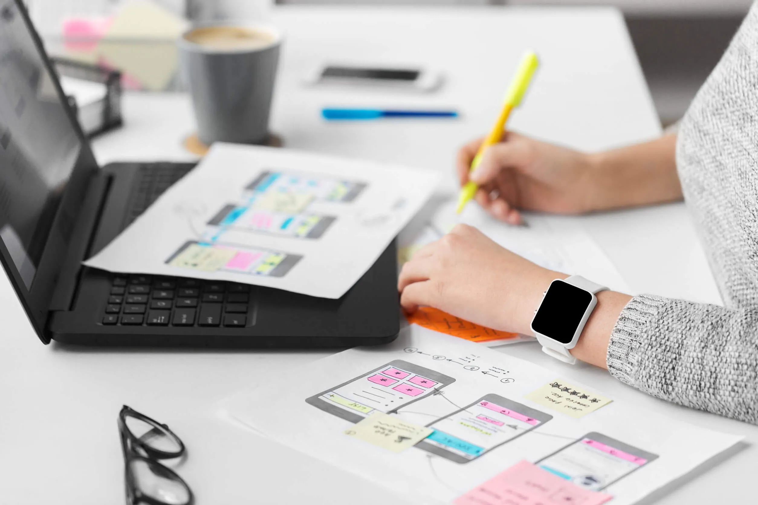
Web Design 2019 Roundup
Web Design 2019 Roundup
Featured & Recent Articles
Web Design 2019 Roundup

With the year rapidly coming to a close, we highlight five of web design’s defining trends and epic moments of 2019.While we all sit in disbelief that another 12 months has flown by right under our noses, it presents a perfect chance to take stock and reflect on the year on the web. Things in the web design world moved fast and furious this 2019. We won’t dwell on the past too much, so let’s get right into it!In no particular order, here are five of our biggest web design trends and epic moments worth repeating. Let’s start the list.
Minimalist Navigation Menus
In 2019, we said goodbye to mega menus. I bet you know exactly what I’m talking about when I say mega menus too. They’re those sites that have a list the size of the U.S. Constitution plastered somewhere on their homepage. Today, these lists are hidden behind a hamburger icon. Those three little bars hide these massive mega menus and provide your homepage with lots of very attractive negative space. Web designers are now trying to redefine the approach to website structure and menu design.


Minimal navigation menus like the one above stick to three to five links in the top tier, making them small enough to stay on-screen for mobile users. Keeping the navigation menu visible provides the user with contextual visual clues about your site/app.
Augmented Reality
Augmented reality (AR) has been in the whisperings for a good while now but the technology hasn’t really lived up to its hype and capabilities. However, we are beginning to see augmented reality being implemented in genuinely engaging and intuitive ways that boost the user experience for brands and the products. Take a look at this awesome use of augmented reality used by exercise company, Peloton.


Augmented Reality still has some maturing to do but there’s a lot of potential here for consumer brands selling items to people that want to test drive what they’re buying.
BIG Custom Types

Example of the oversized custom font on site. Image via Symbols of the Thaw
Typography was huge online this year, with oversized custom types acting as an integral use of design and l Large custom fonts really took off this year. Just check out this beautiful design by Symbols of Thaw (pictured above) as a recent example. With font licensing becoming more and more accessible and affordable, we will see this trend propel into 2020.
Dark Mode
It’s easy on the eyes. It’s popping up on every app and platform. It’s dark mode, and it’s here to stay.

Dark mode on Apple.Image provided by Engadget
Now, dark modes aren’t just a visual perk; there are a lot of important design principles behind them like:
- More energy efficient
- Reduced eye strain in low light conditions
- Darker screens reduce glare, flickering and blue light
In all honesty, dark modes are a bi-product of what we’ve become, smartphone-addicted insomniacs. Five years ago, white text on a black background would have been spat upon in the design community, but those 1:00 am Instagram dives are more important than all that.
Avoiding Design Fads
Parallax, infinite scroll, video backgrounds, and wifi straining animations, all web design trends that should never have caught on. Now, this year probably won’t be so different and there’s already some noise within the community that 3D animating will be the thing in 2020. Sounds super cool, but we’re not 100% sold on it until the average internet connection speeds up exponentially.Brutalism is a design trend that has somehow taken off this year. Some are cool, some not so cool. The important thing to note here is that if it fits within your brand guidelines/ or images, then go for it. This will not be the case for the majority of brands out there so we shall soon bid farewell to this design trend.For now and always, focus on adding value to the end-user because these changes will outlive any superficial makeovers.






.webp)



.webp)
.webp)
