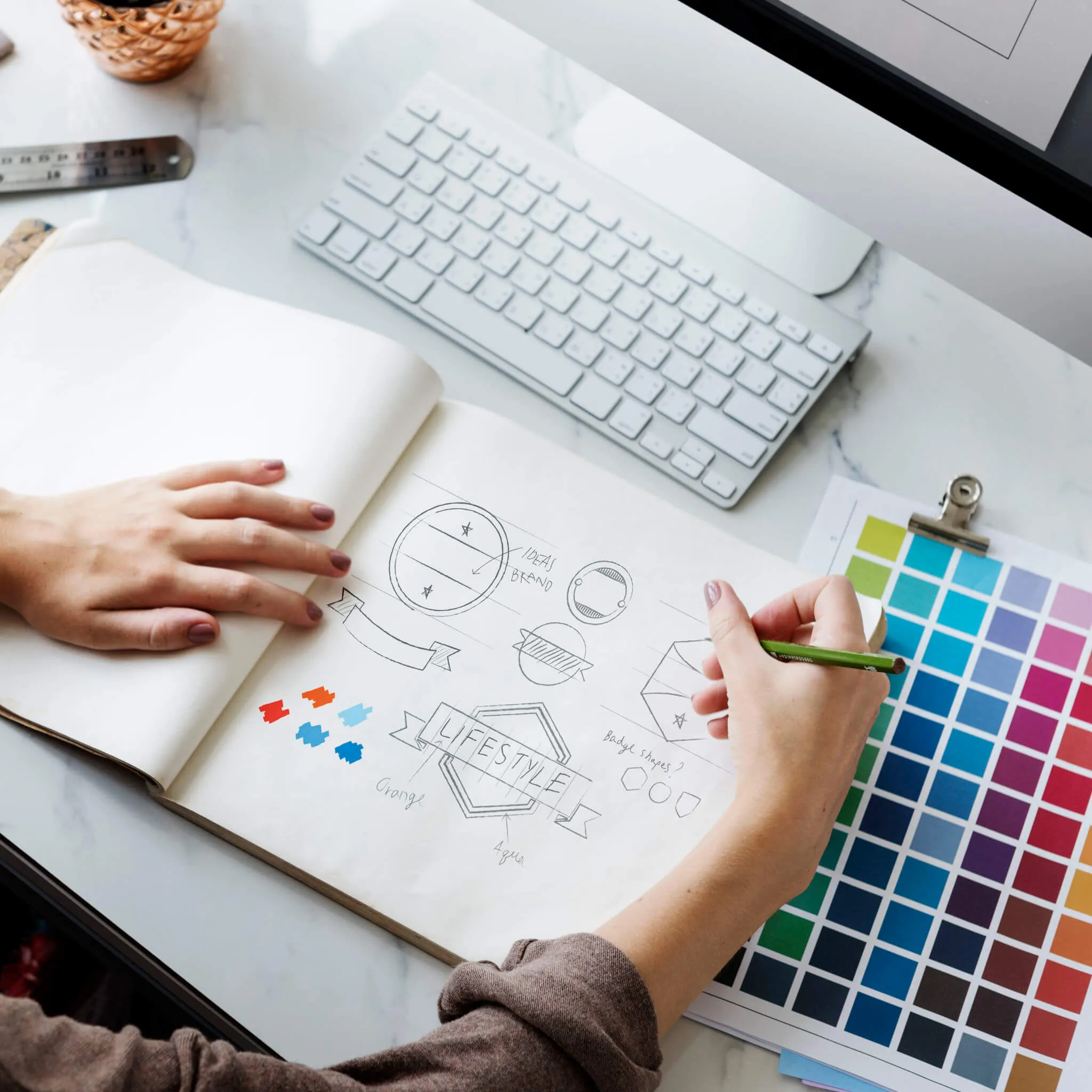
Does Your Logo Need a Facelift?
Does Your Logo Need a Facelift?
Featured & Recent Articles
Does Your Logo Need a Facelift?

In case nobody has told you, let me be the first – your logo is SO IMPORTANT. Your logo is the first thing people will see when they visit your business. Depending on what kind of business you run, this mark will appear on napkins, cups, mouse pads, pens, business cards, envelopes, flyers, shirts, aprons, and more. Your logo will become the visual representation of your brand as a whole. If you feel like you’re slightly embarrassed by your logo or you feel that your competitors are getting a lot of your customers, it may be time to think about giving your logo a facelift. Here are 5 sure reasons it’s time to update your logo.
1. Your logo doesn’t reflect the identity of your brand anymore
One of the key values to logo design is making sure your brand values are reflected in the overall product. Your logo is the forefront of your business. This is what the public is going to associate with your entire brand. For example, If you want your brand to promote a calm and nurturing feeling but your logo is red and black, it may be time to reevaluate what you’re really communicating to the public.
2. Your logo seems dated
This is a huge deal! It is so important to have an up-to-date modernized logo. Especially with all of the technological advancements that are being made every day. You don’t want your logo to look like it’s stuck in the 1990s while the rest of your business is in the present times. A lot of people will argue that they don’t want to change their logo because “they don't want their customers to not recognize them anymore.” Well, did you know that all of the biggest stores and companies you probably shop at on the daily such as target, Walmart, and Starbucks, have all had multiple facelifts to their logos over the years? Updating your logo to be more modern doesn’t mean drastically changing it to the point of it not being recognizable anymore. When your company expands and grows, your logo needs to also!


3. You have more competition now
Maybe your logo was doing your company justice when you first opened for business, but now there are so many other companies just like yours and you’re struggling to keep up. Although a logo may not seem like the biggest deal when it comes to competition, IT IS. You would be so surprised at the difference it will make when your company has a clean modern logo and a cohesive brand identity. Think about the different restaurants, shops, and businesses you have gone to. Why were you initially drawn to this particular place instead of somewhere else? Chances are it’s because their overall design attracted you there. Design is a powerful tool for communication that can greatly HURT or HELP your business. If you want to keep the customers coming and stand out against your fellow competitors, think about giving your logo a facelift!
4. Your audience has expanded
What does expanding your audience mean? This means that your original target audience has grown into something larger that is reaching more people. This can happen when a locally owned business begins opening stores in multiple locations, or when a privately owned business moves into a much larger building in a better location. It doesn’t just strictly apply to locally/privately owned businesses either. Large companies can begin shipping products globally rather than only in the United States. All of these are examples of ways in which your company has outgrown its original target audience. During transitional time periods such as these, it’s a perfect time to consider adjusting your logo to suit this new demographic. As stated above, you can only expand and grow so much while leaving your logo on the backburner. It’s important to improve your logo as you move forward to create a cohesive brand identity across all platforms!
5. Your logo has always been the same
Oh geez. Chances are if your logo has always been the same, it is definitely time for a facelift!! Has your company stayed the exact same? Has there been any growth or success? Have you opened more than one location? Have you had to hire more employees due to the business increase? If the answer is yes to any of these questions then it’s time to update your logo! Without a logo for your company, it would hardly be a company. You can’t ignore it and put it in the corner and give it no love! (No one puts baby in a corner! - where are my dirty dancing peeps?!) Seriously, show your logo some love and get it updated. Look around at the competition and evaluate their logos and branding and see if you feel that your company is still surpassing them or not. Remember: An update is not a complete bulldozing of your current logo. It is simply a cleanup and refinement process. Besides, what's to be afraid of? You’ll be included during the design process and no one is going to make you change your logo to something that you don’t love. Hopefully, after reading this you can make a better decision about whether or not it’s time for a logo facelift! Also, if you didn’t already know, you now have more clarity on the importance of a good logo design. It’s the face of your business! Do you wash your face at night and in the morning to clean off the dirt from the day? (Hopefully, you thought yes, but if not, it’s a judgment-free zone). If you find yourself in the position of wanting to update your logo but not knowing where to turn to, call Red Shark Digital! A consultation meeting ain't never hurt nobody. Our branding offices in Raleigh and Greenville can help you design the best logo to fit your vision. Scroll down to see more examples of company logo evolutions through the years! I think these are so fun.
Pepsi – Check out 1898 compared to today! Night and day difference.

Volkswagen

Barbie

Dunkin Donuts

Even though this app isn’t old at all, it’s still had a few facelifts!





.webp)


.webp)
.webp)
