Shaping Your Business Logo for Endless Value
Shaping Your Business Logo for Endless Value
Featured & Recent Articles
Shaping Your Business Logo for Endless Value

It's old news at this point - design is significant in showing and communicating messages and feelings in your advertising. The mental effect of color specifically is a popular topic and design consideration for most marketers, particularly with regards to conversion rates, yet unless you are a designer by profession or simply a lover of art, it's far-fetched that you've thought deeply into the impacts of shape. Like color, shapes have passionate implications and can trigger distinctive pictures and recollections in individuals' minds. For example, think of the shape of a heart or the shape of a star. Just those two shapes can cause you to feel certain ways or feel certain emotions. Organizations like yours can very easily benefit from these inherent impacts to communicate your brand and values through your logos; however, keep in mind you initially need a full comprehension of the most widely recognized elucidations of various shapes. Below are just some of the items that a logo’s shape can convey to potential clients/customers!
Symmetrical/Geometric
Organization and stability

Organic
Pleasure, comfort, interest and spontaneity

Abstract
Literal interpretations of ideas or directions

Circles
Community, friendship, love, relationships, unity, perfection, attention and protection

Curves
Femininity, motion, happiness, rhythm, pleasure

Spirals
Creativity, growth and evolution

Rectangles
Familiarity, trust, order, peace and uniformity

Triangles
Power, science, religion, law, masculinity, strength, purpose, energy and precision

Vertical Lines
Masculinity, strength aggression, courage and power

Horizontal Lines
Community, tranquility and calmness

Before we even begin designing a logo for a client, we sit down with them and discuss a few things. The first thing we discuss with clients is a list of values that the client wants their logo/brand to convey. Once we have this information we can not only start looking into what shapes to use for that client, but which typefaces and colors will smoothly follow. When it comes down to it, there are 2 things that will vastly affect your logo planning process.
- 93% of purchasing judgements are made on visual perceptions. This means that almost every single person that may buy your product will be buying it solely based on how it looks.
- 84.7% of consumers cite color as their main reason for buying a particular product. We’d like to think it’s more complex than this, but simply put you may have the same logo as the brand next to you, but while theirs is black yours is red therefore stands out more.
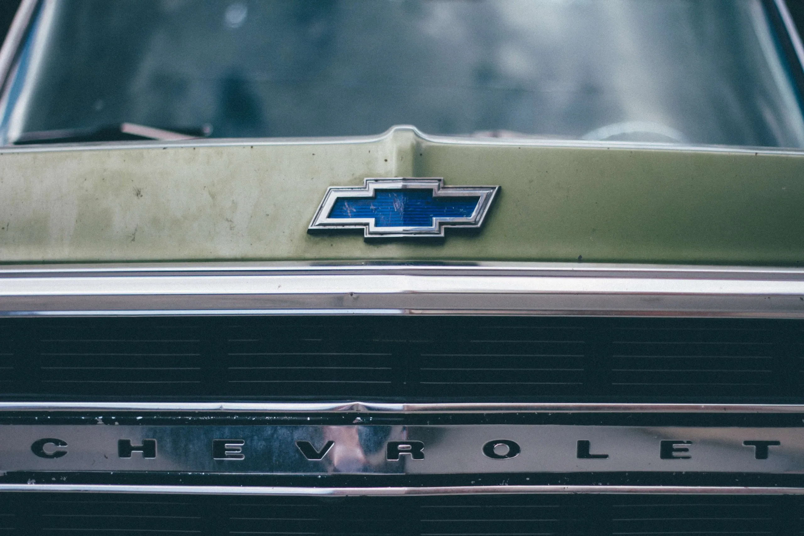
Now that you know a little bit about logo design, let’s take a look at Chevy’s logo. The Chevy logo can technically fall under a few different categories. The first and most obvious category I would put the Chevy logo in is the symmetrical/geometric category. Chevy has a very clean logo that has NEVER been changed. To me this logo screams organization and stability. This logo could also fall under rectangles, horizontal lines and vertical lines. Even though this logo isn’t a perfect rectangle, it still has the straight clean lines and slight shape of a rectangle. The Chevy logo fully captures everything that Chevy is known for is just a small logo with no text. Chevy is know for ads with clean lines and very clear messages. One of the biggest attributes about the Chevy logo is that it has never changed. Chevy was started in 1911 with simple script font of “Chevrolet” as the logo. In 1913 the logo was changed to its current shape (the bowtie) that it is today, and has not changed since then. The biggest selling point that Chevrolet tries to get across to customers is that they are dependable and sturdy, having the same logo for over 100 years definitely conveys that message.
Trust Our Branding Greenville NC Agency for your Logo Design Needs
These are just a few key points to remember when creating or choosing your logo, which is what your brand will almost solely be known for. Don’t trust yourself to create something so vital to your business’s success? Don’t fret! We here at Red Shark Digital specialize in creating logos and other creative solutions that are guaranteed to make your brand standout! Contact us for more information or if you're interested in working with us!





.webp)



.webp)
.webp)
